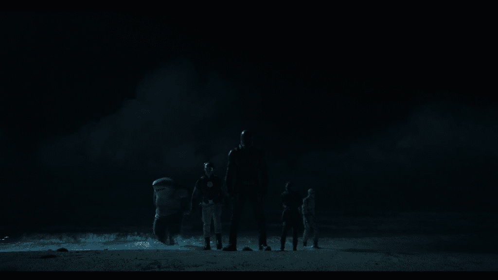
James Gunn briefed us that he was looking for treatments that were evocative of 60’s caper war films.
Alpha Midnight, a 1969 typeface designed by Hiroshi Yamashita, was the base and inspiration. This type treatment is bold and bright enough to sustain legibility over the footage it lives on. And it stays true to the 60’s vibe we were after. The stencil also gives it a military quality that feels very appropriate for a caper war film.
For a secondary typeface, Garage Gothic, by Frere-Jones Type, worked as a perfect pairing for our stenciled letterforms. A tall sans-serif with quite a bit of grit and personality, inspired by tickets given at parking garages in NYC.
Our design system flows naturally into the end crawl. Small details like the character icons and the bullet holes in the dot leaders really make this a unique end crawl design.
